I am very excited to see that the preview for PowerApps in PowerBI has been released ( see Announcing availability of PowerApps custom visual for Power BI (preview) ). I saw this demonstrated months ago, and have been waiting impatiently ever since. Every time I have embedded a Visio diagram into PowerBI, I have wanted to display the selected shape data in a detail view … and now I can!
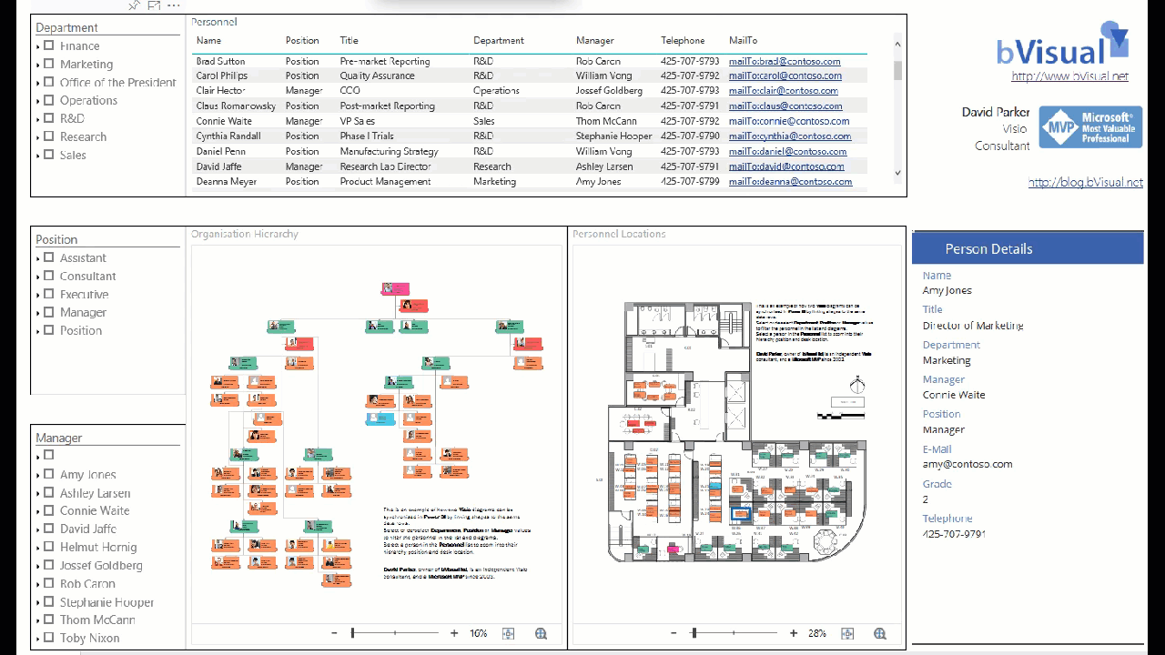
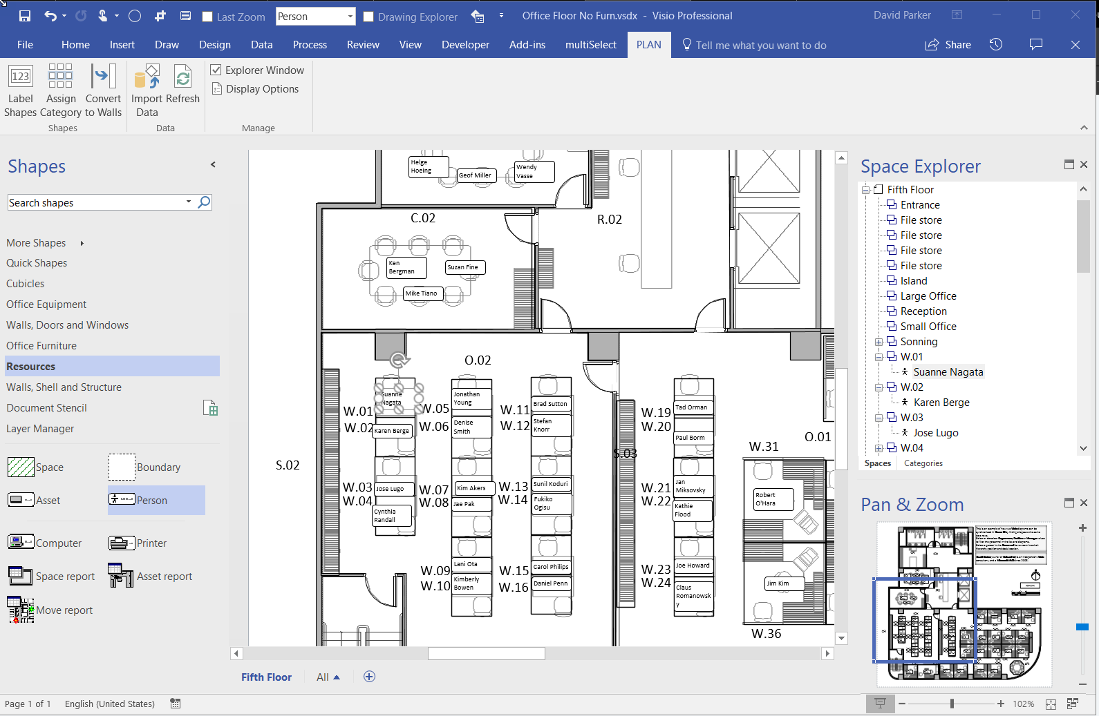
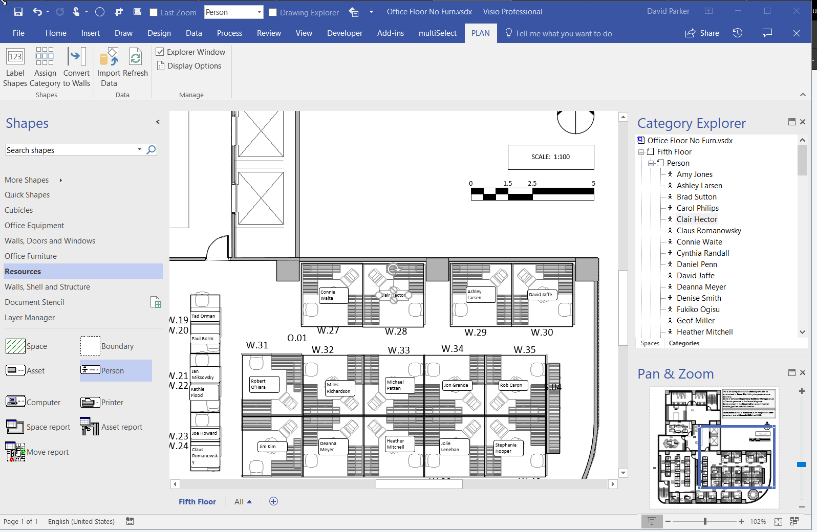
I cannot yet create a PowerBI report with the embedded PowerApps visual for consumption by the whole internet, but it should still solve many scenarios for organisations. I quickly added the new PowerApps visual to my example synchronised Org Chart and Desk Layout from my previous article ( #Visio in #PowerBI for viewing personnel hierarchies and locations ) , and recorded a simple selection in the following gif:
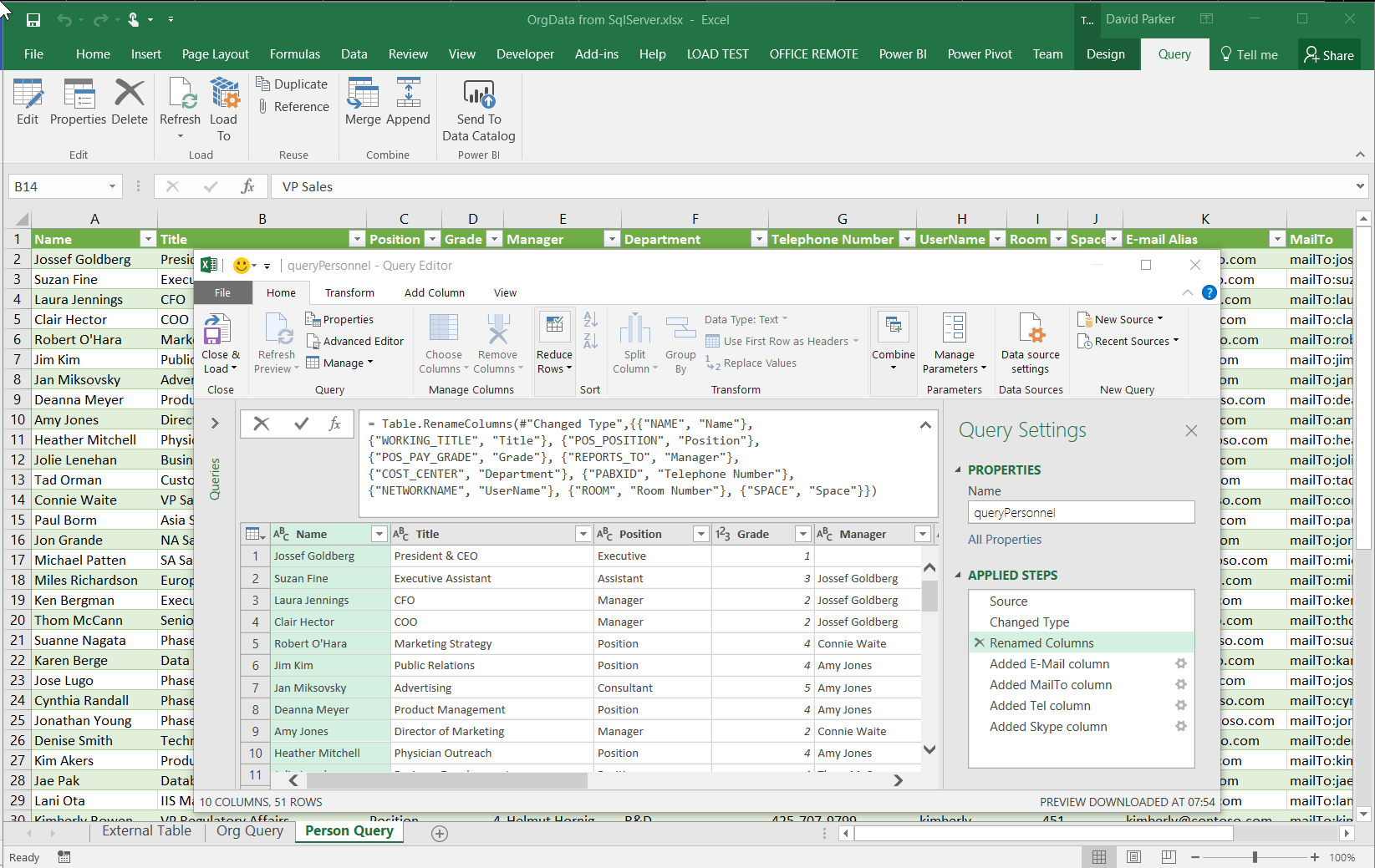
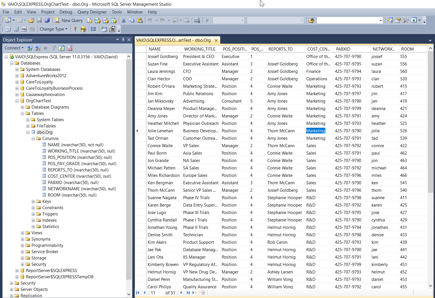
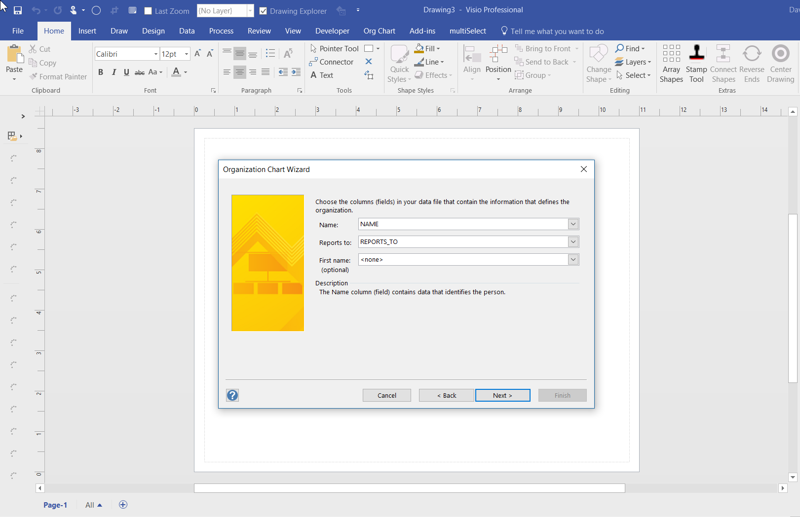
To do this, I simply created a default new PowerApps app from the queryOrg query in Excel workbook I created previously, and modified the Item value for the DetailForm of the DetailScreen. I removed the BrowseScreen and EditScreen because they were not required. Then, hey presto, the correct record is displayed whenever a shape is selected.
Archives for January 2018
Visio in PowerBI for viewing personnel hierarchies and locations
My last article, Aliasing Data Columns for #Visio Organization Chart Wizard , mentioned the slight anomalies in the default Shape Data rows for the Organization Chart shapes and the Resources / Person shape. This prompted me to create an alternative view of the same data that can be linked to the Person shapes on a floor plan, and then to use the preview Visio Custom Visual in Power BI to display both views of personnel synchronised by the same data. This demonstrates how easy it is to create an effective dashboard for locating personnel locations and their position within an organisational hierarchy at the same time!
Aliasing Data Columns for Visio Organization Chart Wizard
One of the most frequently used components of Visio is the Organization Chart Wizard (OrgChWiz), but it is also one of the most frustrating because of its apparent inflexibility. I was recently asked how to use different table column names with the wizard because the originating ODBC source could not be touched. Well, I have previously used Access to modify and enhance tables in this situation, but the OrgChWiz is quite old, and does not like using the newer Access queries as a data source unfortunately. If the basic table column names do not match the default column names in the organization chart shapes, then there may be superfluous Shape Data rows created on each shape and the ability to change the shape style is compromised, and the Shape Data rows get quite confused!
The Organization Chart template opens with the Belts – Organization Chart Shapes stencil open by default, although the Master shapes used can be replaced with those on one of the other nine using the Org Chart / Shapes gallery: